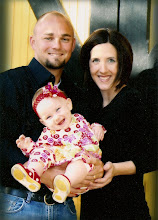
This is the first invitation I worked on...something about it just wasn't "right!" The font was too small or something...
So I kept playing and this is what I came up with! I like the modern and funky twist it has with the added polka-dots...and seriously...don't polka-dots just make you want to smile? I am noticing that the pictures are a little off-kilter, but I bet I can fix that a little later before I commit to printing them!
I am sure my hubby will be reading this post sooner or later (yes...my husband is one of my most frequent readers...believe it or not) and when he does, he should give me a pat on the back for saving him lots of money!


5 comments:
My suggestions: Make sure all files you used are at 300 dpi, plus the entire file is at 300 dpi, to prevent it from being pixilated when printed. I'm guessing you made it a specific size... 5x7?
i think they look great! i do like the second better with the bigger font and polka dots. think what all you can do with all the money you saved....
TOO cute! I love both designs and think you did a great job! (not that my opinion matters, lol)
PS sorry if you get this comment like 8 times, it kept giving me an error!
The only way I know to check it is in photoshop or any other photo editing program. you can always just print 1 and see if it prints okay, then print the rest! Just a tip, cause I'd hate for you have all of them printed and then notice they came out blurry! Been there, done that!
Oh and 300 dpi...means 300 dots per inch!
Post a Comment